A new website for a company return
Pan American
Airlines
Techniques Used:
Secondary Research
Competitive Analysis
Survey
Style Guide
Wire-framing and Prototyping
Testing and Iteration
Project Overview
Background
Pan American aims to reenter the airline industry with a modern and user-friendly website. The new platform will enable users to easily book, check-in, and modify flights.
Project Goals
We want to understand how customers go through the process of booking, changing, or checking their flight and to modernize the process.
How are companies tackling these issues as well? What sites look modern, what issues are companies facing, and much more?
My Role:
UX Research
User Experience
UI Designer
Tools:
Figma
Adobe Illustrator
Zoho surveys
Duration:
4 weeks
80 hours
Design Process
Origin
Pan American World Airways, or "Pan Am," held the position of the primary U.S. international air carrier from 1927 until its closure on December 4, 1991. Planning a new airline launch in 12-18 months, they seek a streamlined and thoughtful user experience for their upcoming venture.
Research
Surveys
Overall Thoughts
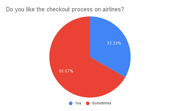
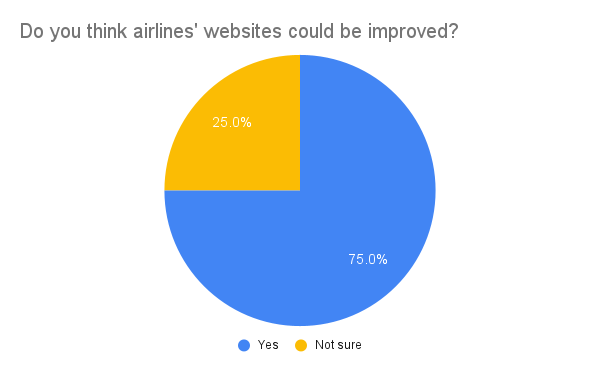
In my UX project for Pan America Airlines' website relaunch, I surveyed and interviewed frequent flyers to identify pain points and preferences in the flight industry. The surveys targeted users who regularly undergo the checkout process on airline websites, aiming to gather both quantitative and qualitative data for valuable insights. Additionally, interviews provided firsthand experiences, uncovering user perspectives on pain points, interests, and overall thoughts about the checkout process.
Competetive Analysis
In this thorough competitive analysis, I delved into the airline industry, studying the styles, features, and strategies of key competitors like American Airlines, Southwest, Delta, and Alaska Airlines. Extracting valuable insights from each company, this knowledge will guide the design of additional project components.
Define
Personas
I crafted personas using insights gathered from user interviews and surveys. These visual representations capture user preferences for leaving reviews, comments, and system usage, providing a clearer understanding of customer needs within the airline industry.
Affinity Map
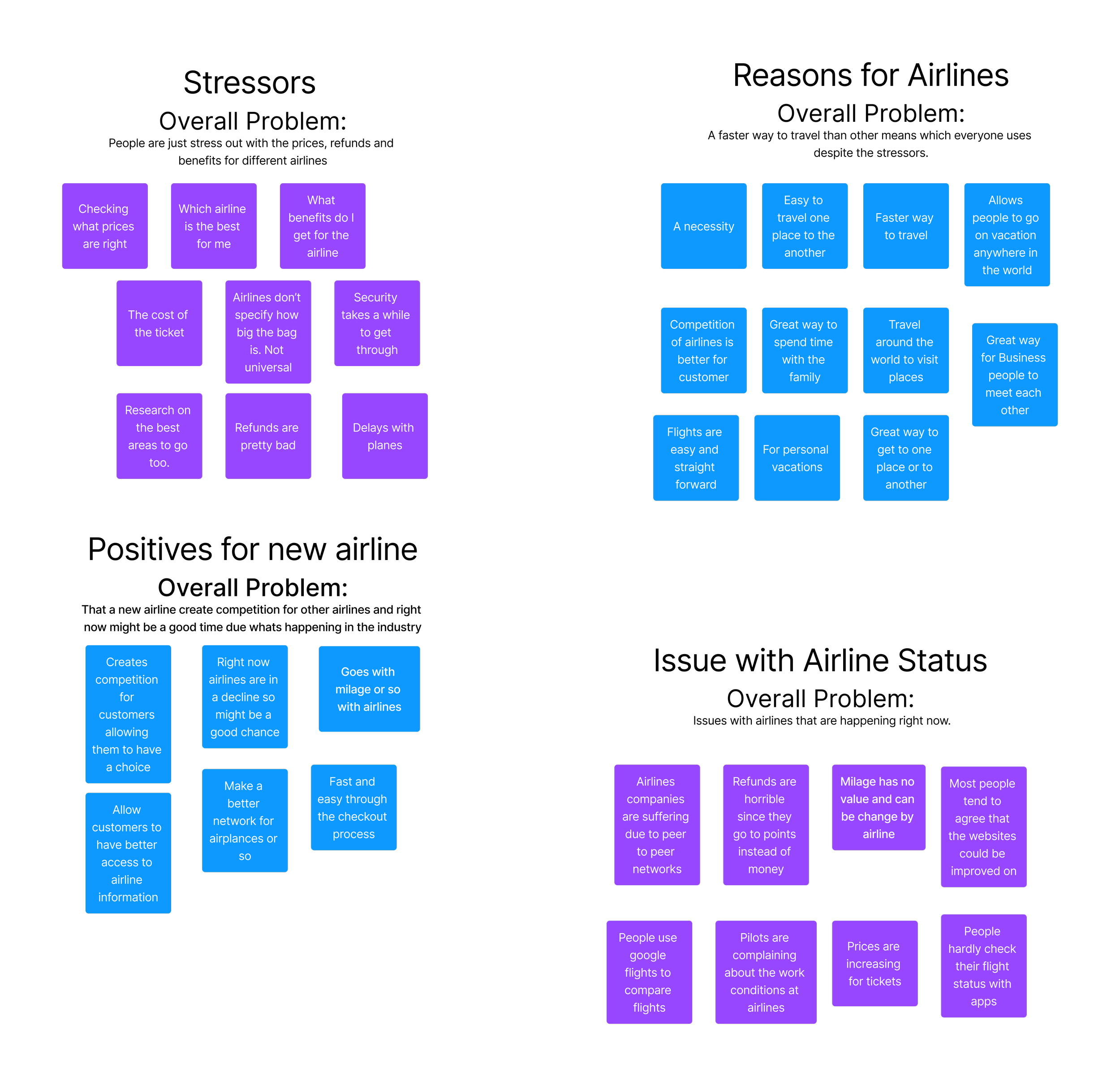
Using user surveys and interviews, I collected valuable insights. Employing the affinity mapping technique, I categorized and grouped responses to reveal common themes and patterns, highlighting key stressors, positives, and issues. This visual representation aids in identifying and prioritizing areas for improvement, guiding thoughtful design decisions to address the app's challenges.
Key Takeaways
Pricing is a common concern for travelers, who often prioritize cost over airline benefits or reputation.
Airline policies, especially regarding refunds and security, are criticized.
Additionally, the aviation industry faces challenges, with pilots protesting poor working conditions, frequent delays, and cancellations. Even airlines like Southwest, using a decentralized system, experience issues, as demonstrated by recent flight cancellations due to crew location uncertainties.
Ideate and Design
Site Map
With all the gathered information and visually represented, I can start the process of creating my design. The first step of my design is to obtain a layout of the website, which I utilized the sitemap. Sitemaps are great for narrowing down the steps needed to reach the final objective and to get an overall look at how the website might function. Now, for Pan America Airlines, I just need to complete the checkout process and the flight confirmation part of this assignment.
User and Task Flow
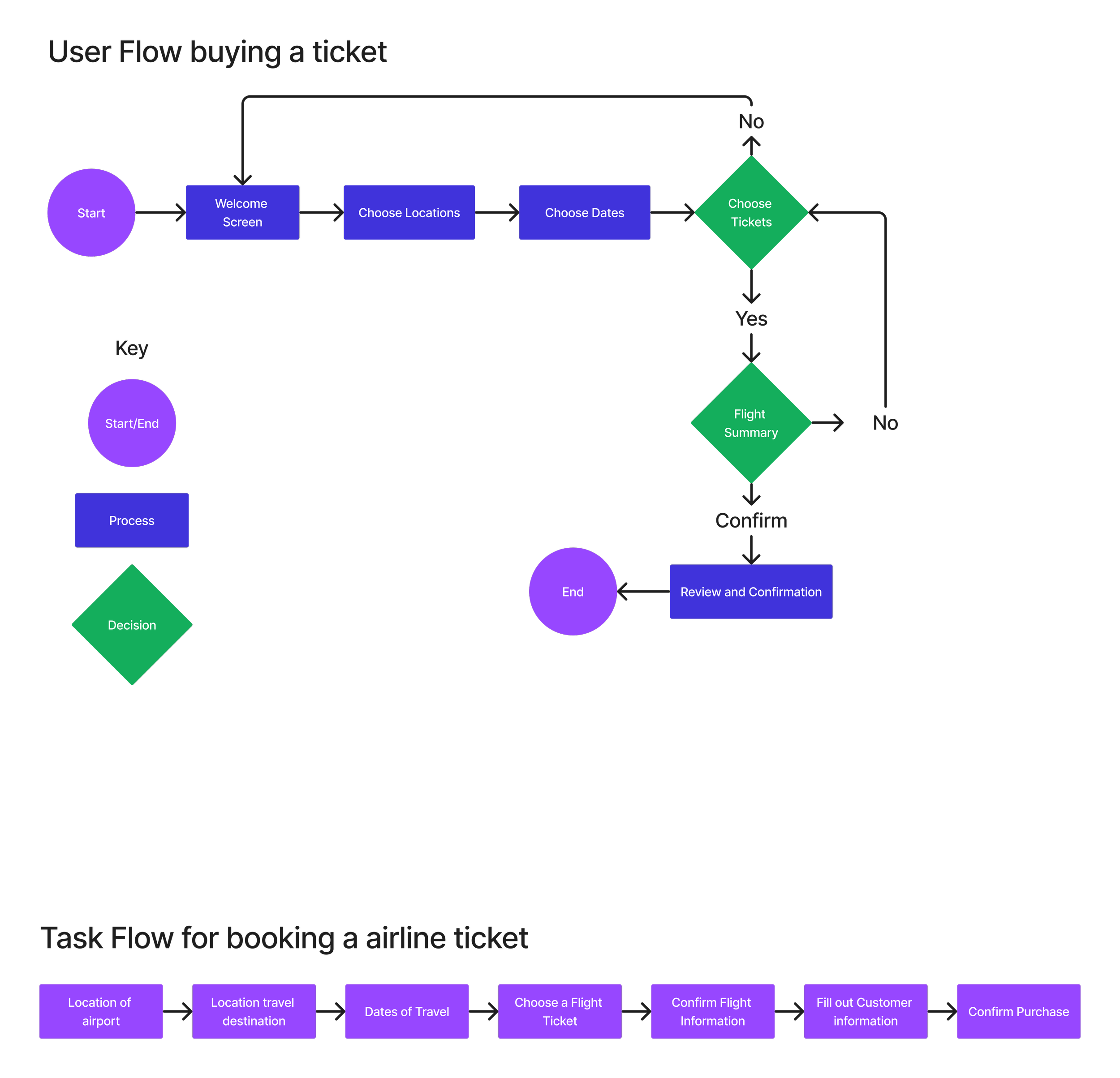
With a clearer understanding of my project's content and website ideas, the next step involves designing pathways. I've crafted task and user flows to outline how users will navigate the website. Task flows provide a high-level overview, while user flows delve into specific decisions, potential paths, and overall functionality, ensuring a comprehensive understanding of the user experience.
Design
Low Fidelity Wireframe
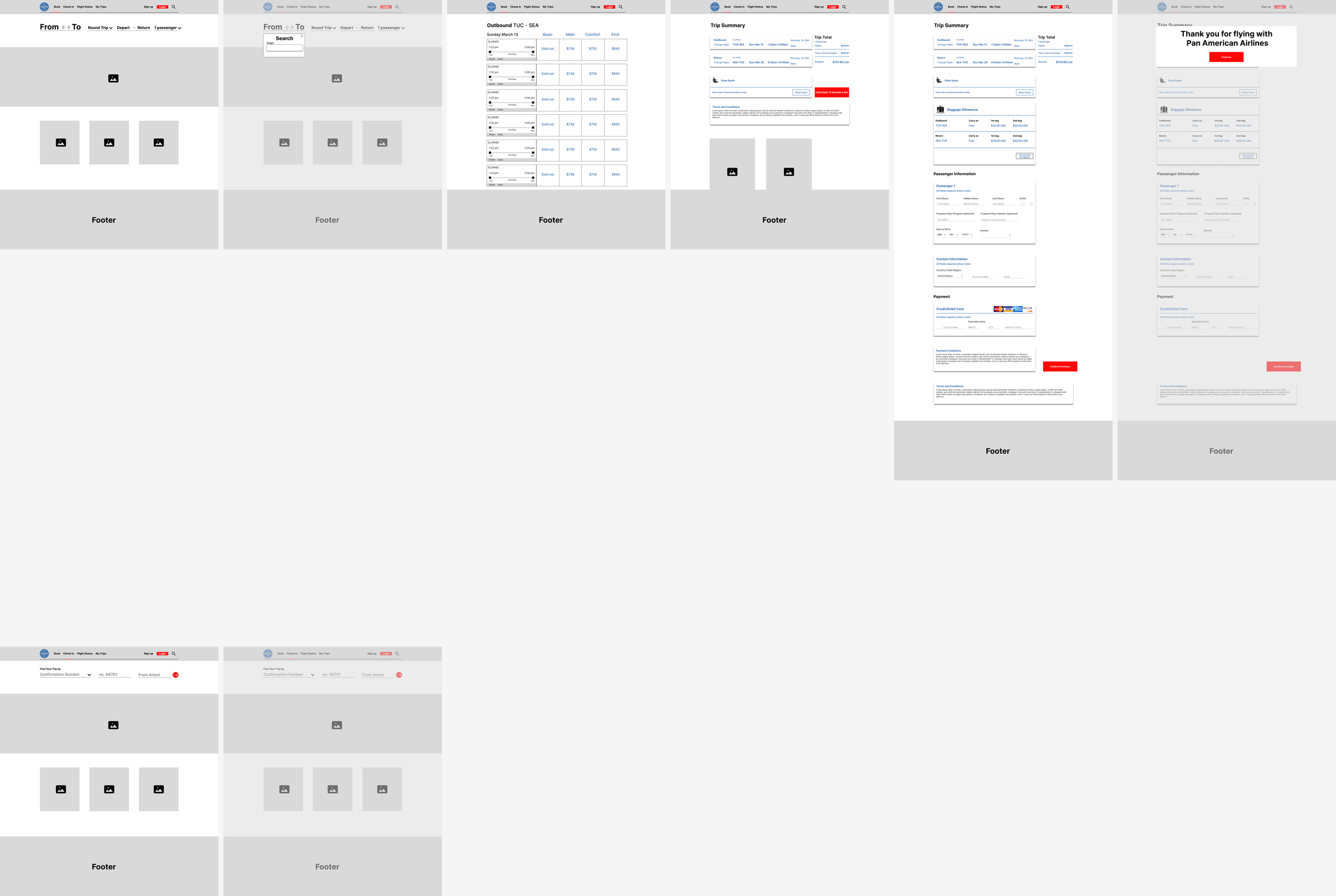
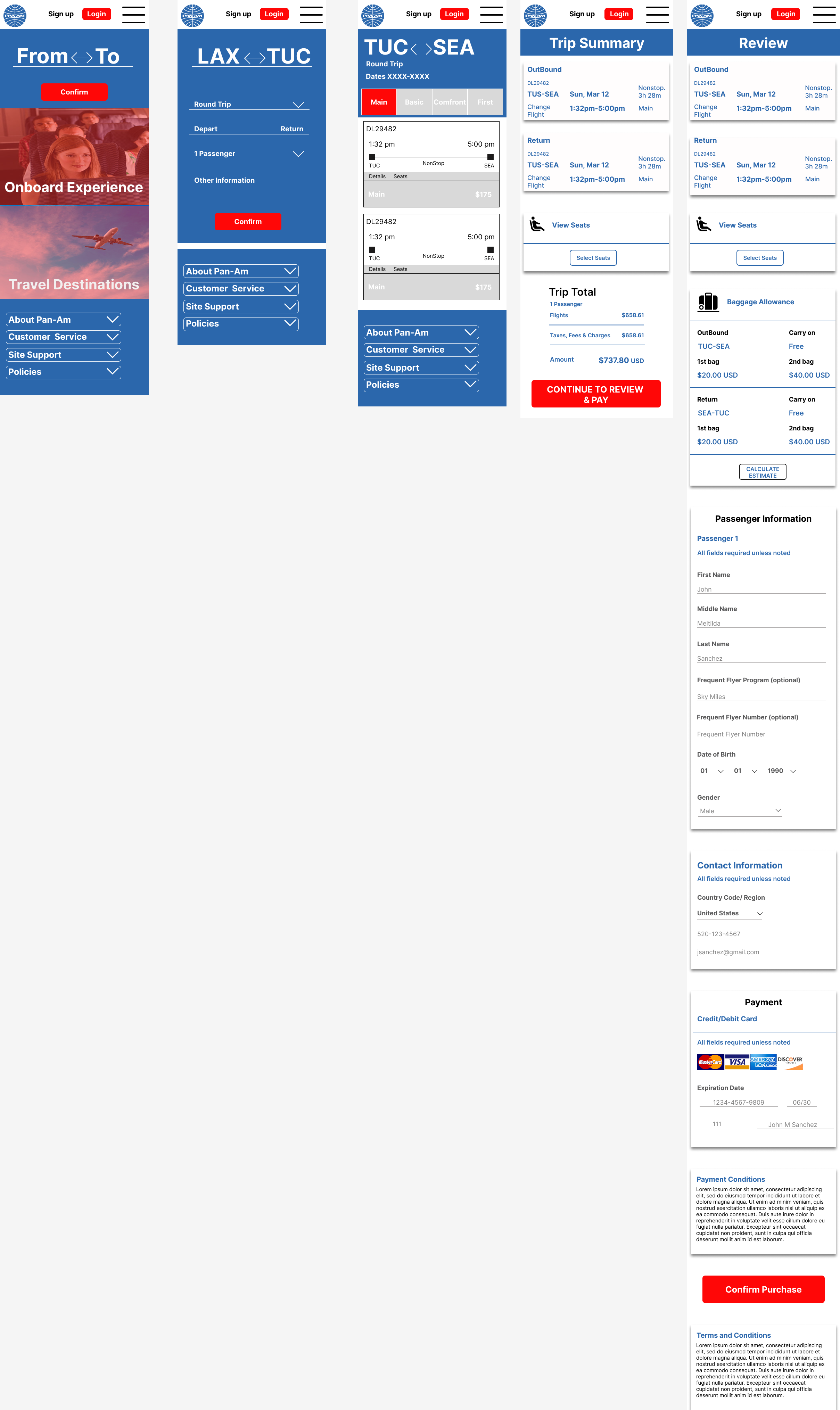
Armed with gathered information and a directional concept, I initiated the design phase by creating low-fidelity wireframes for both the website and mobile. These wireframes serve as a foundational guide, outlining the basic functionality and placement of elements. Prioritizing key features like the main page, destination selection, ticketing, summary, checkout, and check-in pages, I generated rough design concepts to visualize the overall look before advancing further in the design process.
Mid Fidelity Frame
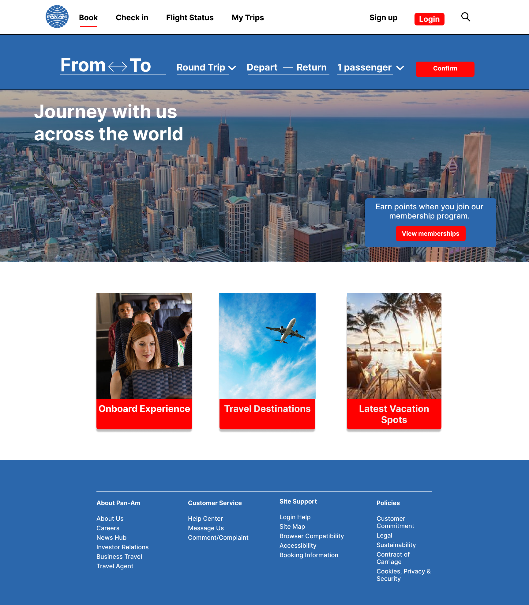
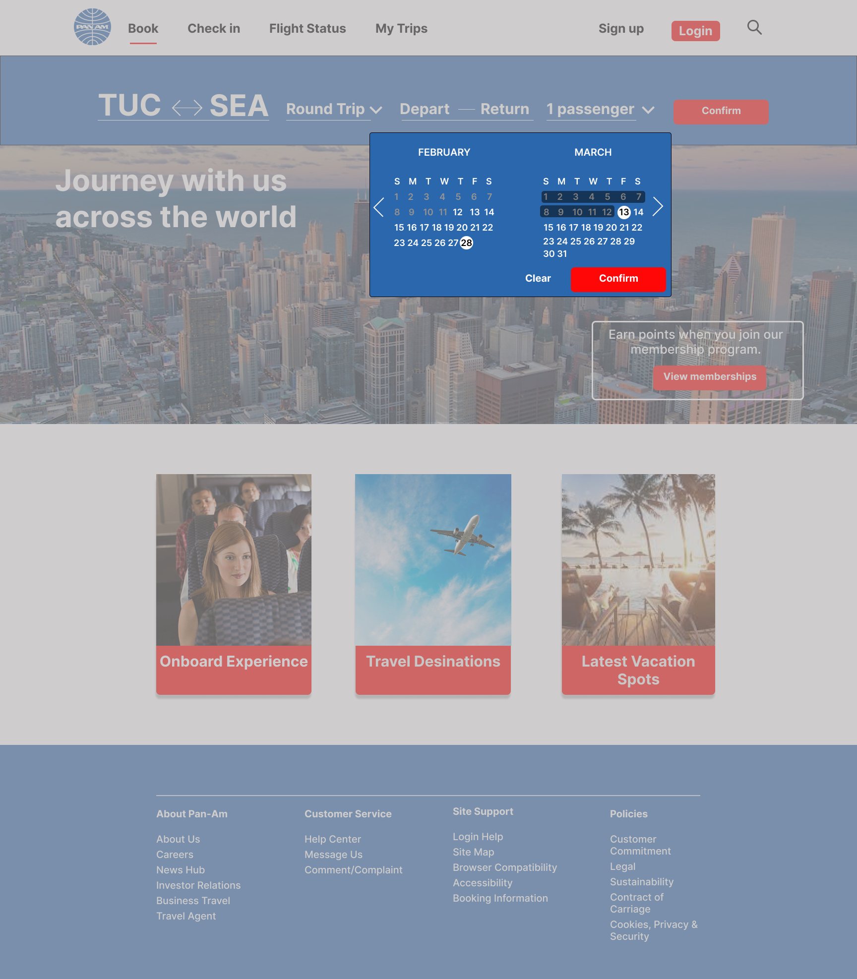
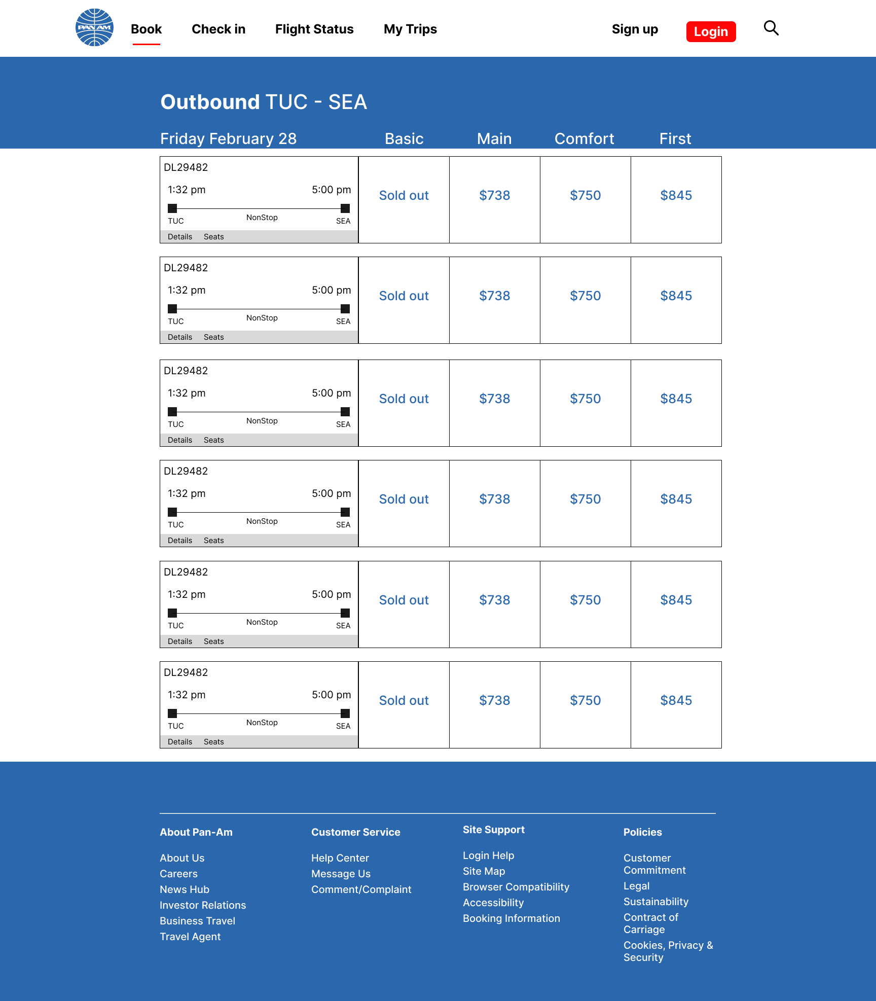
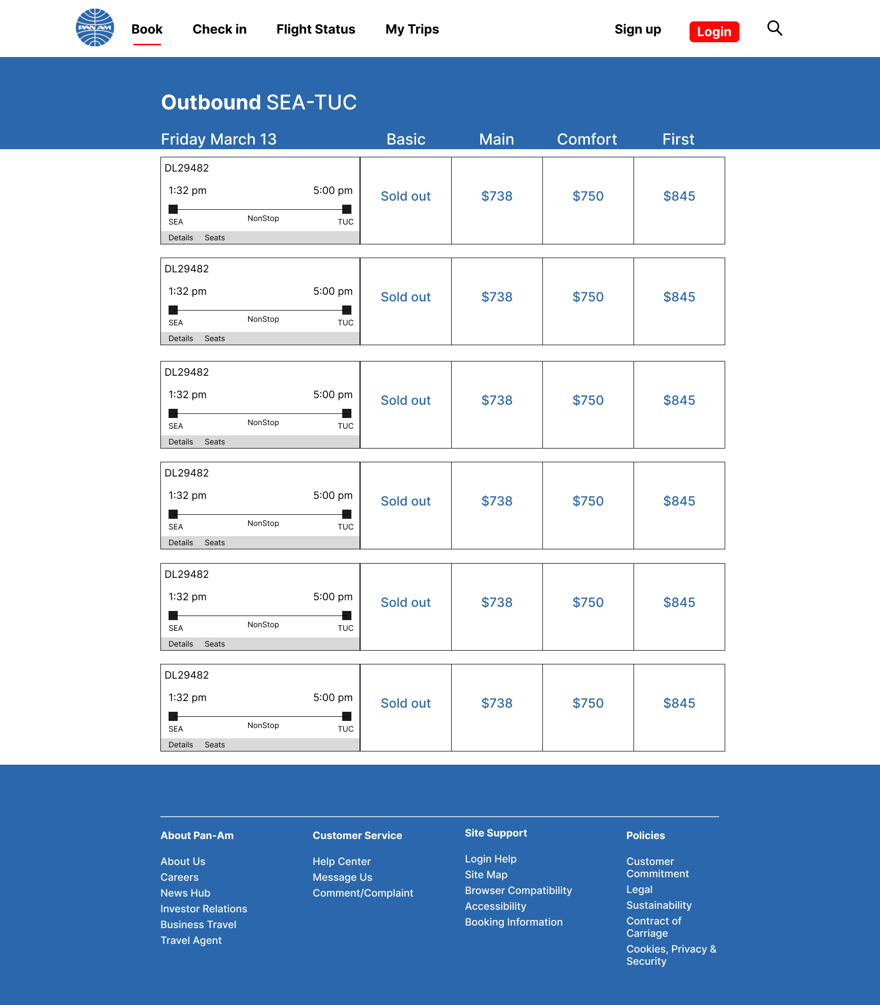
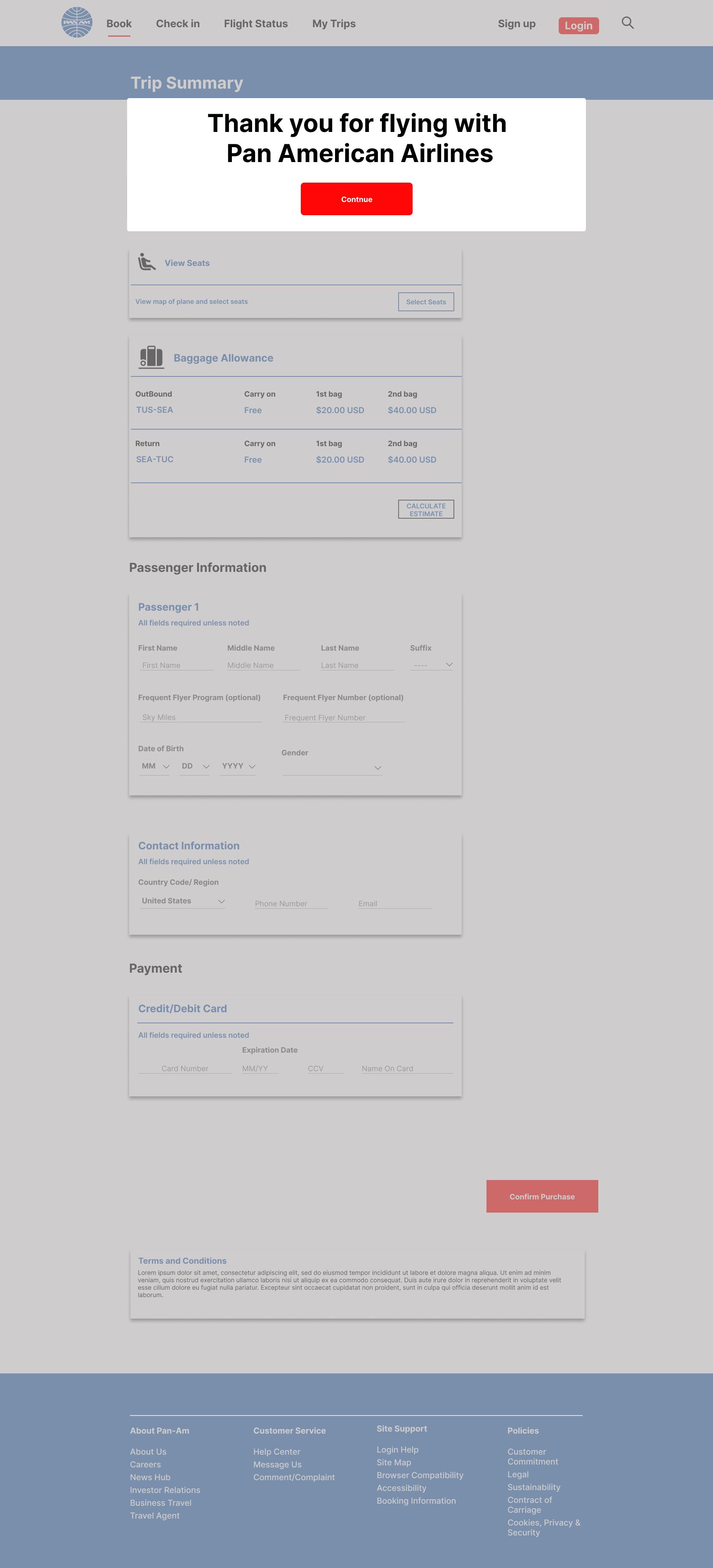
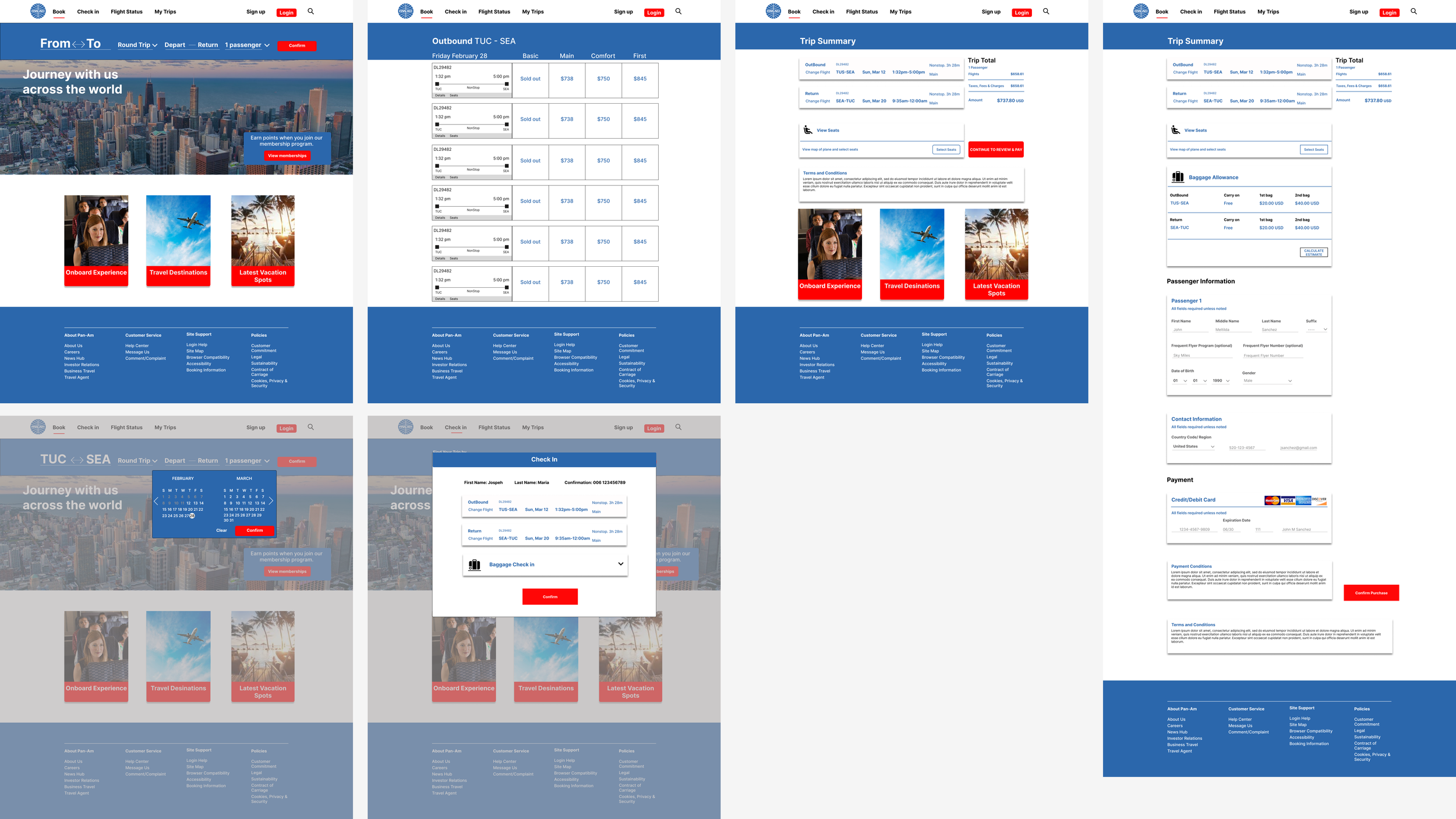
Continuing the design process, I moved on to a mid-fidelity wireframe, providing more detailed insights into color usage, call-to-action placement, and the overall aesthetic. This stage allows for a closer examination of design functionality and flow. I incorporated Pan America's color scheme, logos, symbols, and images to refine the visual representation and gain a clearer idea of the design's final look.
High Fidelity:
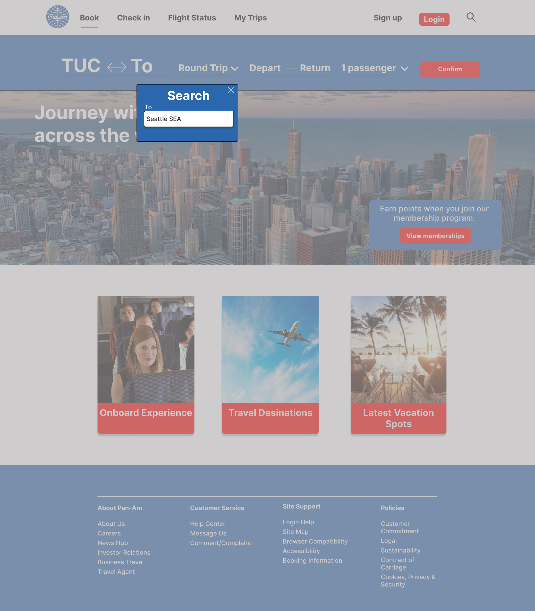
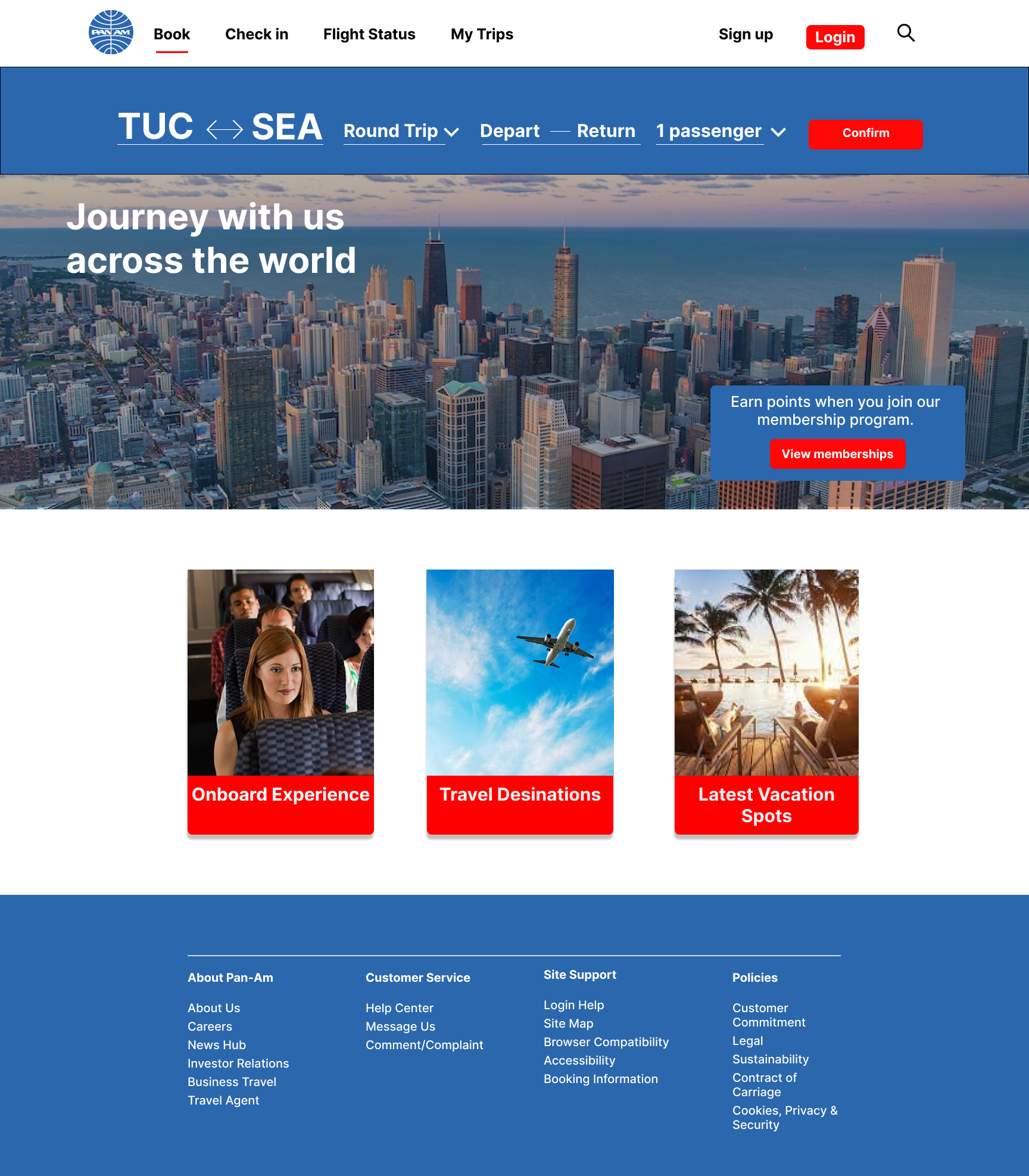
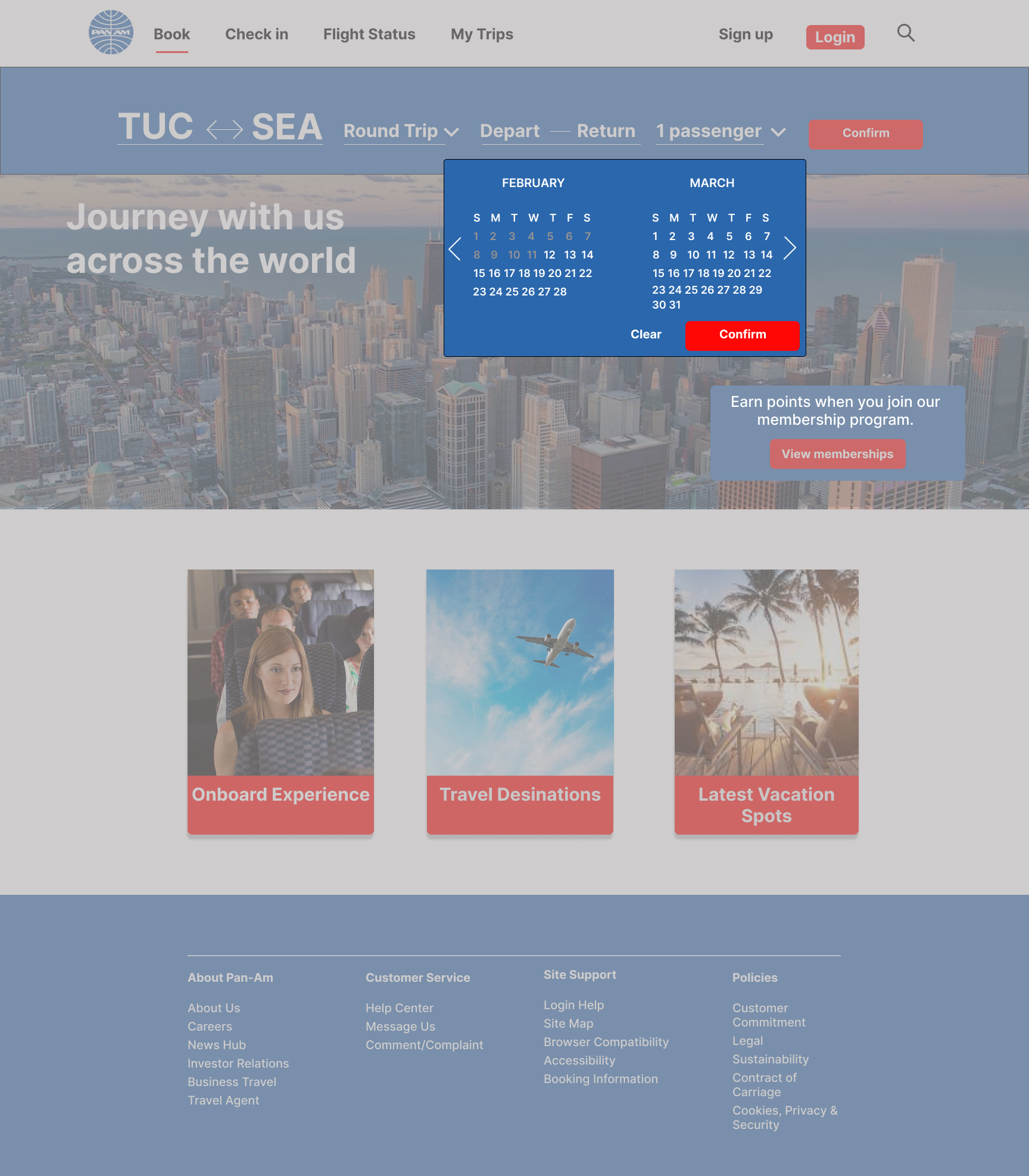
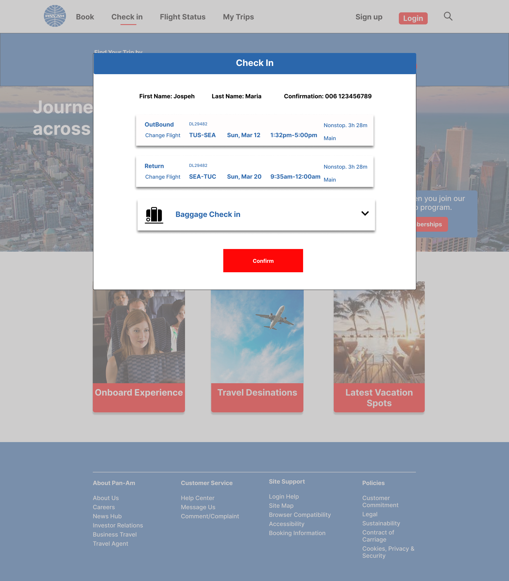
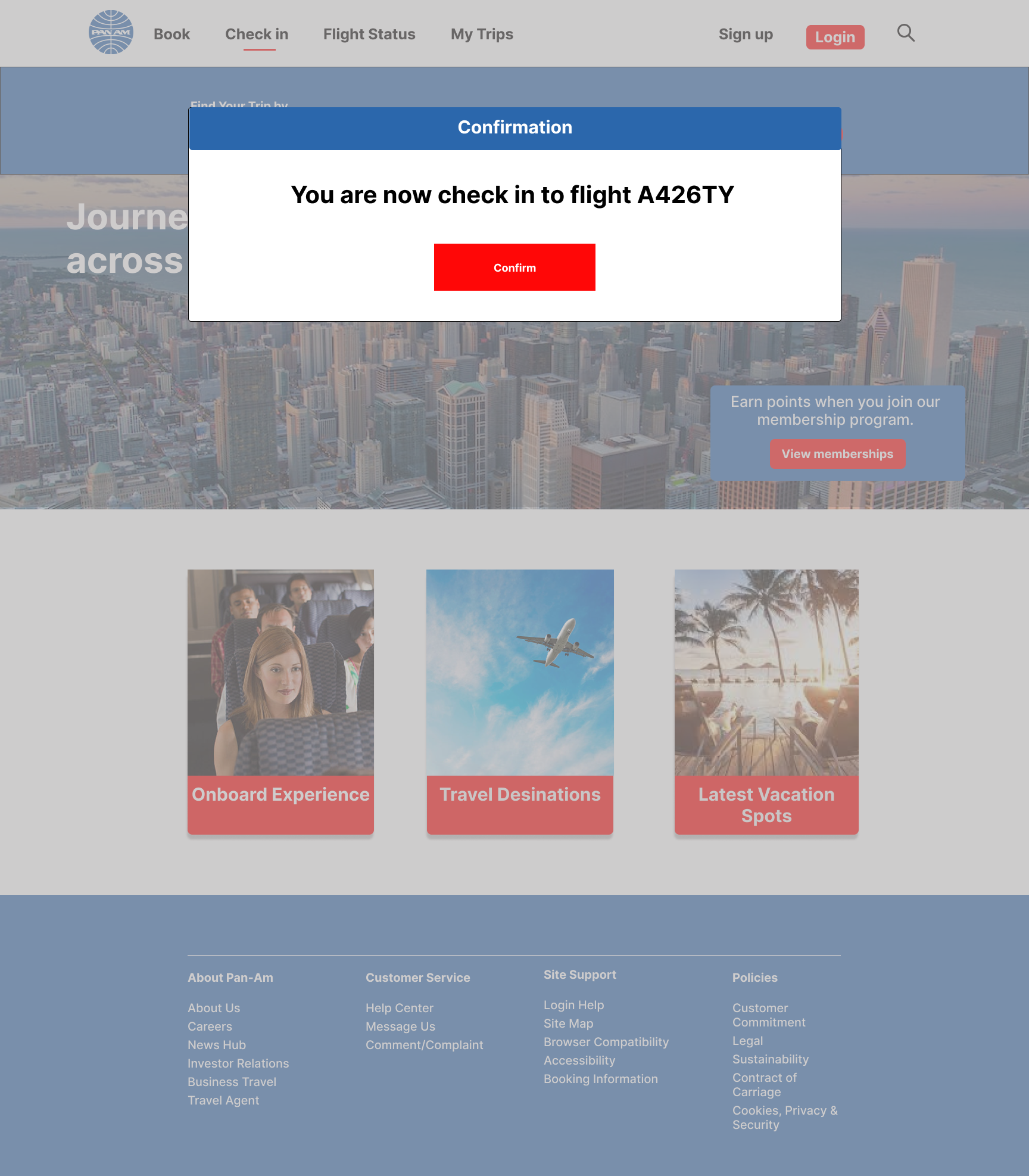
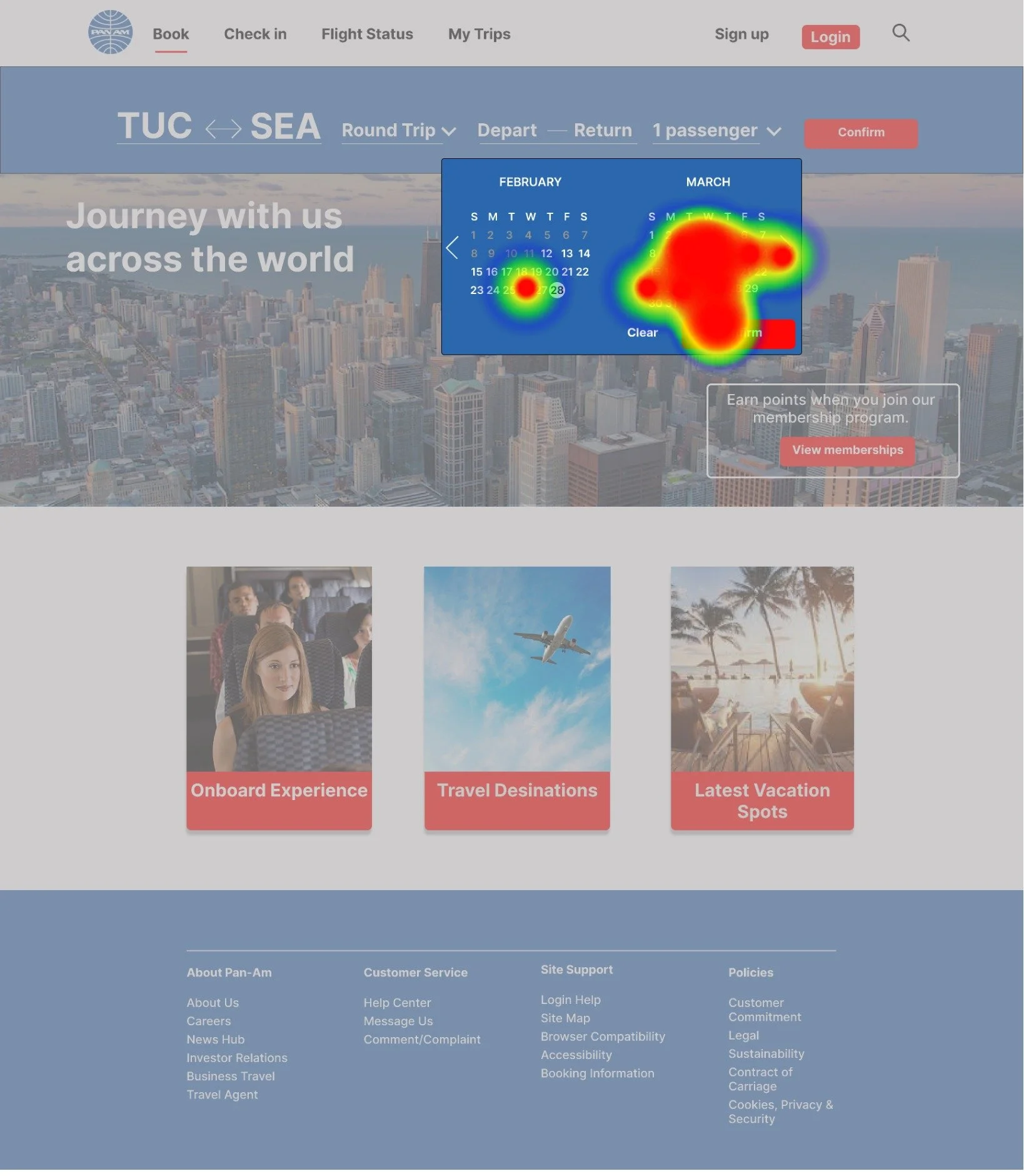
The final phase of the design process involves detailing and refining for usability, achieved through the creation of high-fidelity wireframes. This step adds intricate details and pathways, ensuring the design looks polished and functions seamlessly. In my high-fidelity project, I incorporated transition frames, designed the calendar, and focused on both functionality and visual appeal for an enhanced user experience.
UI Kit:
This is the UI kit I employed for my website. It's straightforward, and I found it to be simpler than anticipated, requiring fewer components.
Logo and Icons
I kept the logo design simple by using the Pan Am logo. I created additional icons, like the seat and baggage, to enhance the design, drawing inspiration from similar elements on other websites. Overall, it was a straightforward process.
Usability
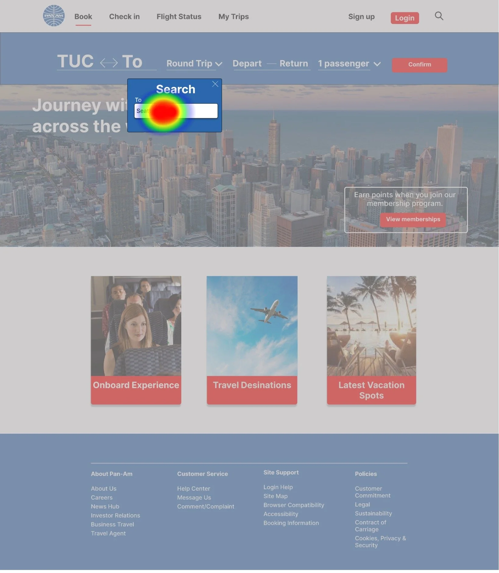
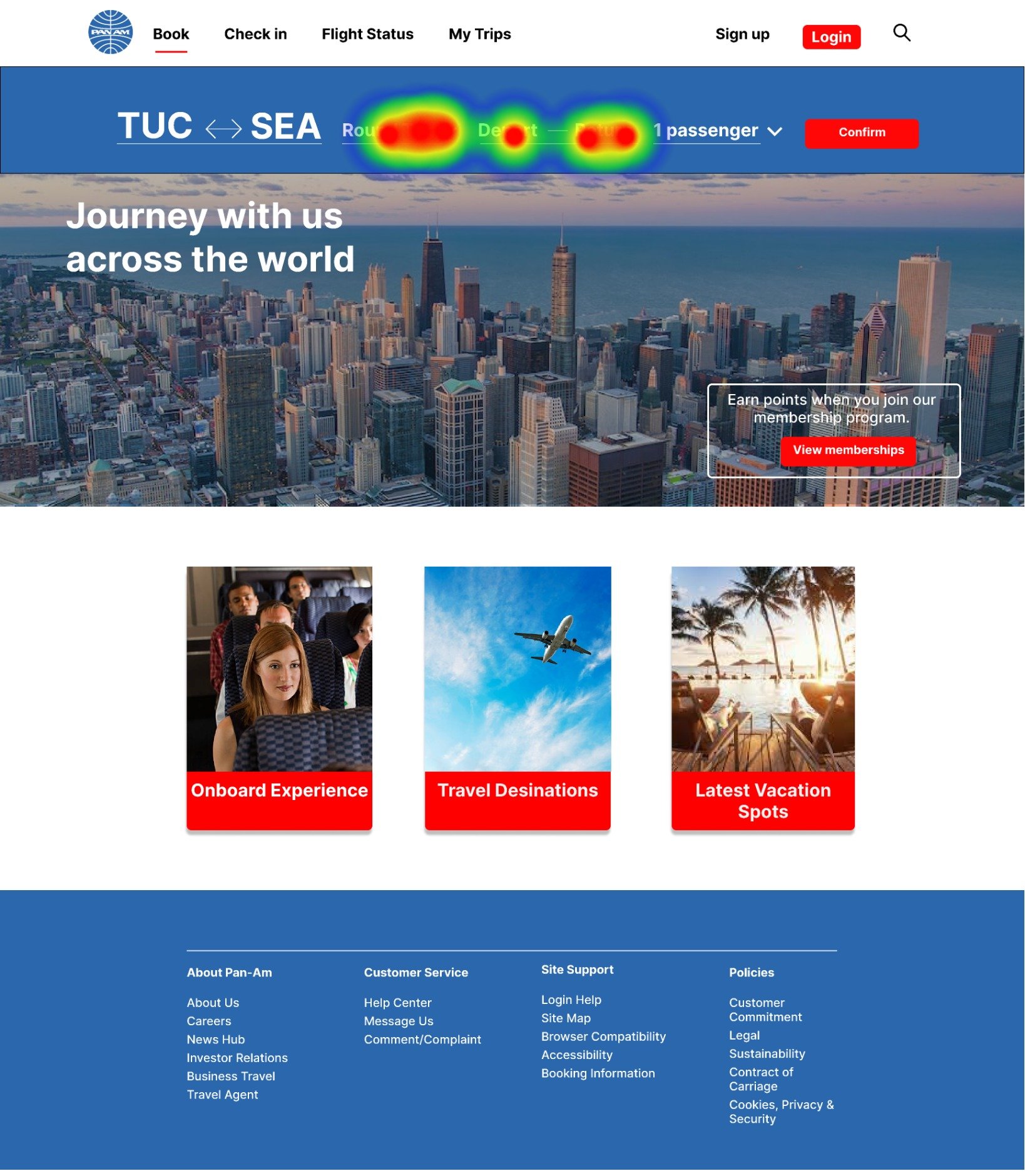
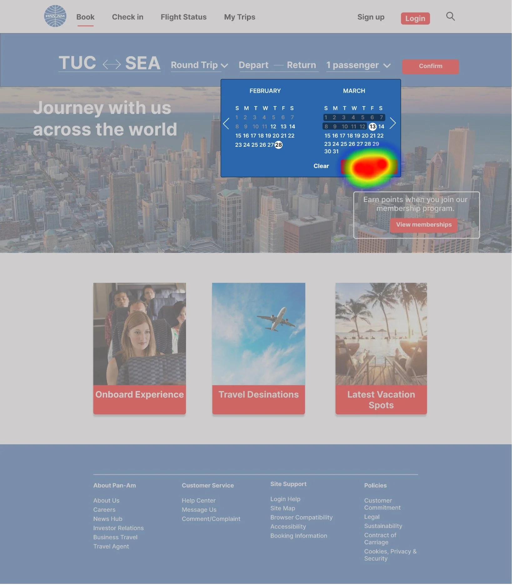
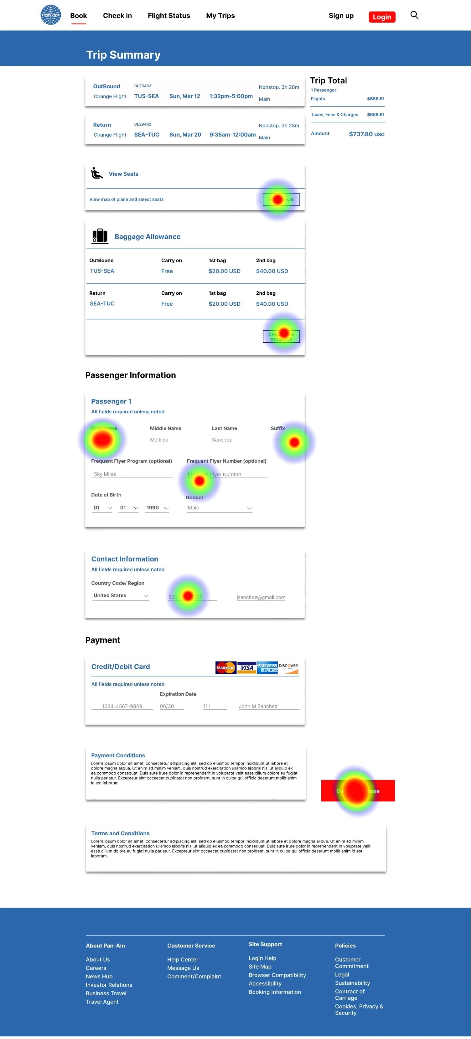
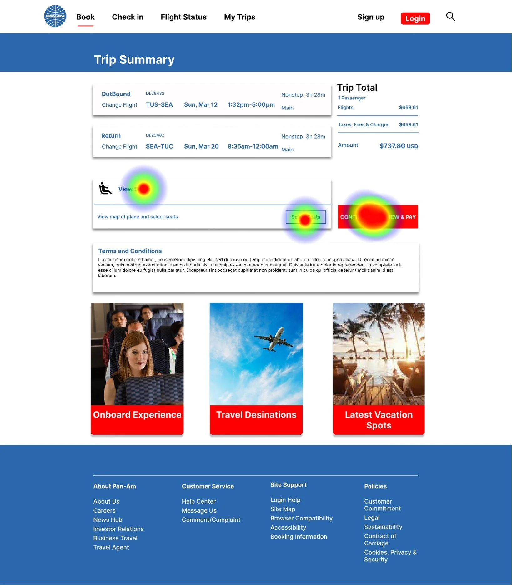
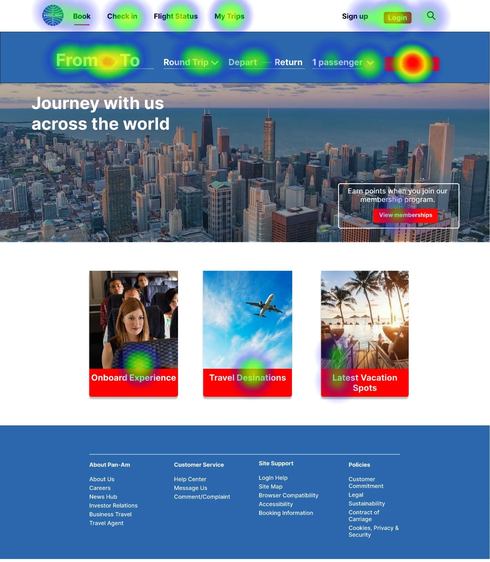
For the final project phase, I tested the website's functionality by conducting usability tests with six participants using Maze. Their objective was to book a plane ticket and check-in:
The majority found the process fast and simple, navigating easily. However, some noted the need for clearer instructions, as a few participants had difficulty recalling travel dates.
Additionally, visual improvements were suggested, particularly regarding the visibility of buttons on the main page background.
Final Thoughts
Takeaways and Iterations
Understanding Objectives: Initially expecting a simple check-in system, I realized the complexity of the checkout process, involving luggage, additional passengers, destinations, and more. Fortunately, early clarification of objectives facilitated the design process.
Moderation in Design: Struggling with the urge to jump to mid or high-fidelity design, I now appreciate the importance of low-fidelity as it establishes the design foundation. It's essential to focus on individual aspects instead of aiming for the overall picture right away.
Iterative Approach: For future development, I would refine the project based on usability test results, continually enhancing its functionality. Launching and closely monitoring customer interactions on both the website and mobile devices would be key to assessing user preferences.


